Does a sales page have to be long?
No. Its purpose is to help someone decide to buy. A simple purchase can use a short sales page. Add detail for unresolved questions, not to meet a word count.

Ecommerce conversion
Send an item click to a product page, a range to a collection, and a distinct offer to a campaign page. A sales page can be short or long. Choose the explanation the buyer needs before building another destination.
Choose your page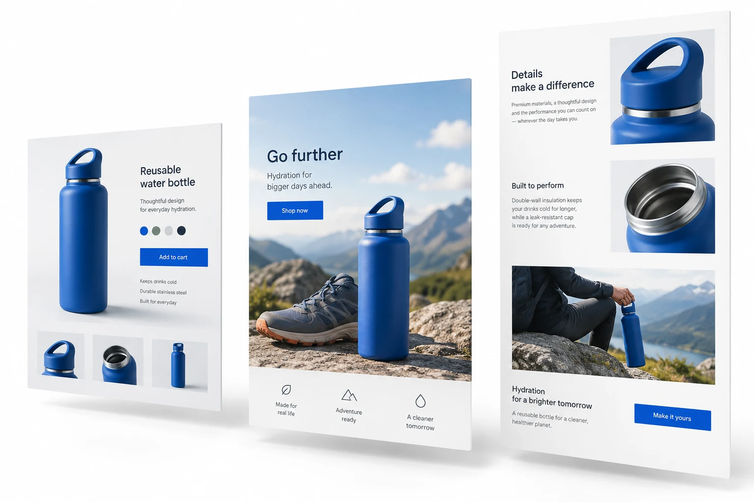
Make the page decision
Our recommendation: keep the existing destination when it already answers the ad promise and buying questions. Use these four questions to identify what needs to change, then test the recommendation.
Your next page decision
Answer four questions to see a suggested destination and the first thing to check.
The selector runs in your browser. Your answers are not sent to Stan Consulting.
The comparison
A product page sells a catalog item. A collection helps buyers choose from a range. A campaign landing page focuses on a particular promise or offer. These names describe different jobs; they can overlap.
| Destination | The buying job | What to build or keep |
|---|---|---|
| Product page | Buy the item shown in the ad. | Correct variant, price, useful product details, delivery, returns and a working buy action. |
| Collection page | Choose among relevant products. | Useful filters and differences between items. Keep a curated range page if it already does this well. |
| Campaign landing page | Understand a distinct offer, bundle or use. | The ad promise, offer terms and a clear path to the correct purchase. It may sell directly. |
A sales page is designed to persuade someone to buy. It can be short or long, and in ecommerce it can also be a product or collection page. Purchase purpose and copy length are separate choices.
Terminology: Shopify's landing-page guide and sales-page examples. A longer explanation is useful when it resolves a real buying question; a new URL is not automatically required.
A simple item can stay simple. If an ad shows a blue running bottle and its product page makes capacity, color and delivery clear, keep that page as the control. Cold traffic alone does not justify another destination.
When the promise is a range
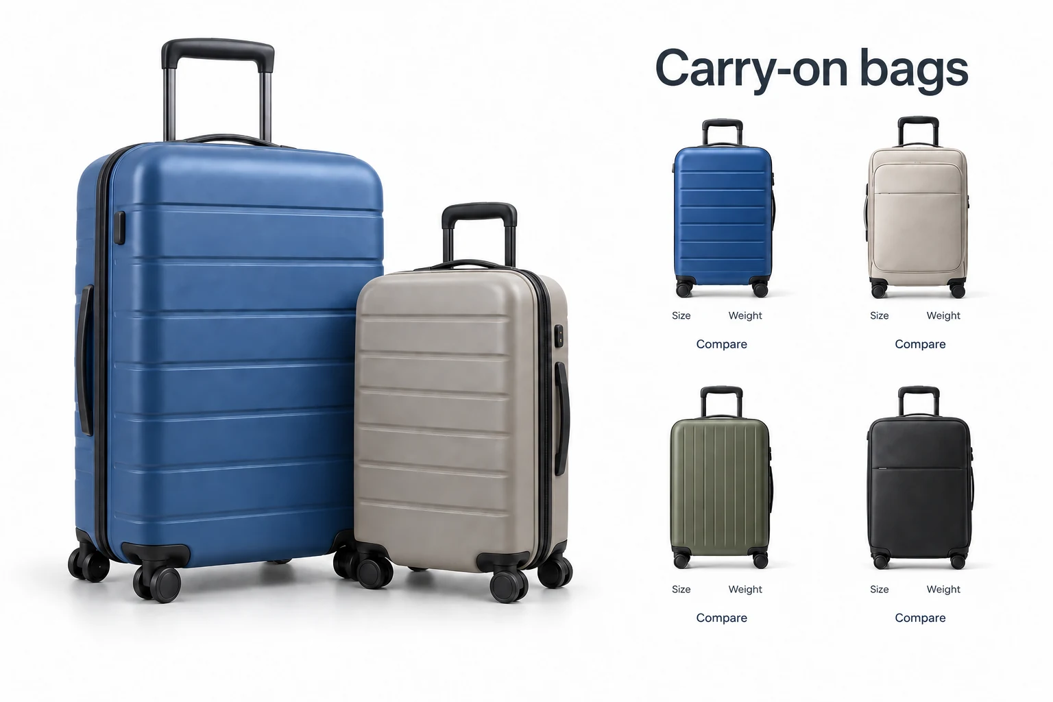
A search ad promises carry-on bags, with no model singled out. Show the range and the differences that matter: dimensions, weight and capacity.
First change to test: make those comparisons easier on the existing collection. A single-bag pitch answers a narrower question than the ad asked.
When the decision needs detail
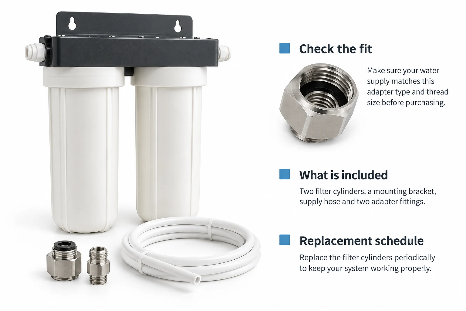
A filter kit raises questions about fit, included parts and replacement. Show the fitting and explain the maintenance before the purchase action. If it is sold as a subscription, make recurring charges and cancellation terms clear.
First change to test: add the missing explanation to the product template. Build a campaign page only if a distinct offer still needs its own experience.
Illustrative situations, not client cases. For the underlying item page, use the product-page conversion guide.
For Shopping product links, Google requires a specific product-focused page, rather than a category, search or generic destination. The advertised item or variant must be the main focus, with key product details matching the feed and a way to buy. Price, currency and availability need particular care. See the Merchant Center requirements.
A tailored product template can still explain a campaign. The label “landing page” does not remove the product-match requirement. Check the actual placement: this rule concerns Shopping product links, including those served through Performance Max, rather than every PMax destination.
Open the exact advertised URL on mobile. Check the selected variant, price, currency, stock and purchase action against the submitted product. Check again after the page finishes loading. Fix a mismatch before comparing designs.
For other placements, our starting test is whether the first screen continues the ad's actual promise. Keep access to delivery, returns, support and product choices where the shopper needs it. Removing useful navigation is a hypothesis to test, not a universal conversion rule.
Write the reason for the alternative before building it. “The ad promises a starter bundle, but the product page does not explain what is included” gives the team something testable. “Landing pages convert better” does not.
If the store cannot gather enough purchases for the planned test, record the result as inconclusive. Use purchase-path checks and observed shopper questions to make smaller changes while retaining a stable control.
A worked decision
This hypothetical USD example compares equally sized, fully reconciled visitor cohorts. Net merchandise revenue is after discounts and refunds, excluding sales tax. Variable costs include net product cost, fulfillment, payment fees and return handling; the refund itself is not deducted twice.
| Measure | Product page | Campaign page |
|---|---|---|
| Completed purchases | 24 | 30 |
| Purchase rate | 2.4% | 3.0% |
| Net merchandise revenue | $2,400 | $2,250 |
| Variable non-ad costs | $1,320 | $1,350 |
| Ad spend | $700 | $700 |
| Contribution after ads | $380 | $200 |
| Per eligible session | $0.38 | $0.20 |
Contribution per session = (net revenue − variable non-ad costs − ad spend) ÷ eligible sessions.
The campaign page records six more purchases and $180 less contribution. A purchase-rate chart alone would miss that difference. This arithmetic illustrates a decision rule; the sample is not evidence of statistical significance or a real page winner.
Contribution still has to cover fixed overhead and page-building costs. Before paying for another destination, compare its expected useful life and maintenance cost with a defensible improvement in contribution. For ad-target economics, use the existing Shopify ROAS calculator.
Before commissioning a page
Compare the cost of another destination with the extra contribution it would need to earn. Use contribution after ad spend and variable costs, consistently with the example above.
Illustrative threshold
4.5¢
$450 extra per month would recover a $1,800 build over six months and cover $150 monthly upkeep.
Matching this threshold covers the entered page costs only. It does not establish a worthwhile return or prove the improvement is achievable.
Required extra contribution per session = (build cost ÷ recovery months + monthly upkeep) ÷ monthly eligible sessions.
Illustration: ($1,800 ÷ 6 + $150) ÷ 10,000 = $0.045 per session. This simple model assumes stable traffic and costs, excludes financing and taxes, and does not predict lift. Use a conservative traffic estimate. Confirm any improvement with a fair test and mature returns.
Send the current URL, ad creative, exact promise, product information and the unanswered buying question. Agree who approves the offer, who changes the page, and who checks the result. A page handoff needs those decisions as much as a design file.
Hypothetical brief. Product facts and acceptance criteria must come from the merchant.
Agree scope, price and access before paid implementation. Keep ownership of your accounts, editable page assets and experiment record.
Download the test briefPlain-text worksheet. Includes acceptance checks, owners, financial definitions and an inconclusive-result option.
No. Its purpose is to help someone decide to buy. A simple purchase can use a short sales page. Add detail for unresolved questions, not to meet a word count.
No. A product template can carry a detailed sales explanation while retaining variants and a buy action. Use another URL when a distinct campaign needs a different experience and the team can maintain it.
No. Start with the actual promise and the existing page. A clear ad for a simple item can go straight to its product page. Test a separate destination when important context or offer terms are missing.
Yes, if it provides a reliable purchase path and the product information the shopper needs. Sending someone to another page adds a step; keep it only when that step helps the buying decision.
Reduce irrelevant choices where they interrupt the campaign. Keep access to information buyers need. Test the purchase result rather than assuming every navigation click is a lost sale.
Landing-page design
Stan Consulting provides landing-page design and ecommerce marketing. Bring the ad, current destination and purchase goal so the project can address the actual gap.
Explore landing-page design