After enough page reviews, the eye starts catching the failure before the spreadsheet confirms it.
Stan Consulting has reviewed thousands of company websites, landing pages, product pages, quote paths, and paid-traffic destinations. The team is trained now. Within seconds, the page usually reveals whether the buyer will understand what is being offered, why it matters, and what happens next.
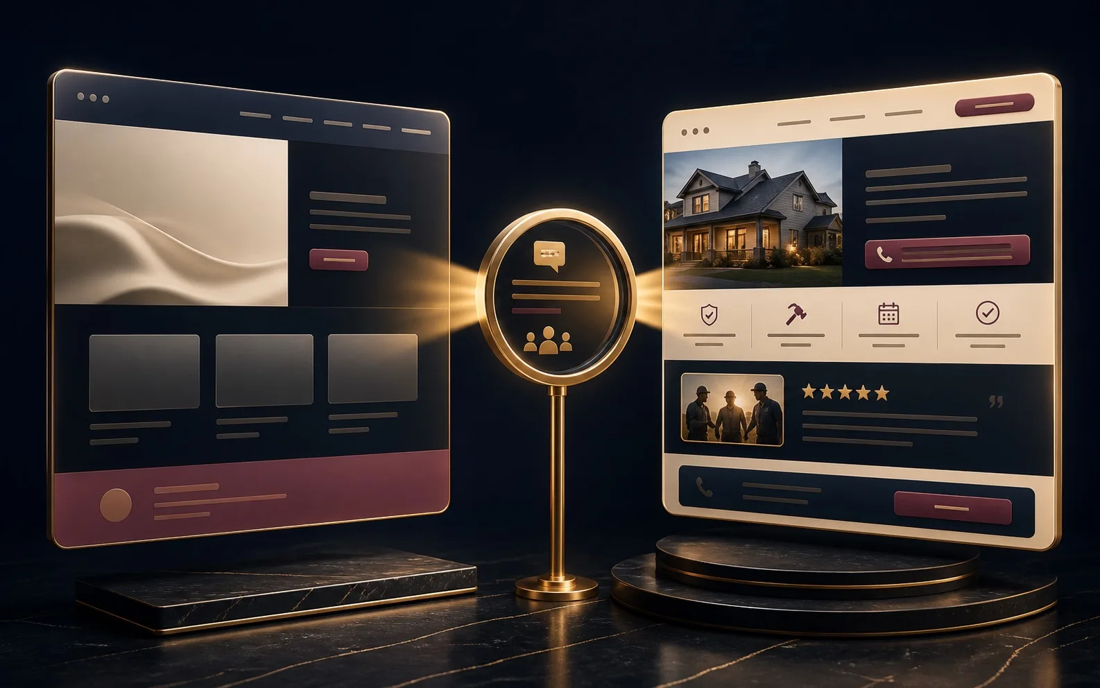
The surprising pattern is not that better design helps. Of course it helps. The surprising pattern is that older websites, even websites with mixed colors, uneven alignment, weak brand polish, and 2006-era layout habits, can still outperform a modern redesign when they carry a clearer story.
Not because old websites are better. They are not. They win when the buyer lands and immediately understands the business, the offer, the human proof, and the next step. The page may look imperfect, but it is commercially legible.
Design is a multiplier. It multiplies the message that is already there.
That is why polished pages can fail so badly. The layout is clean. The typography is modern. The hero looks current. But the page says nothing a buyer can use. The offer is vague. The proof is abstract. The service language sounds like category language. The next step is hidden behind a button that could belong to any company in the category.
A page like that has design, but no leverage. It asks the buyer to decode the business before the buyer has a reason to care.
The stronger page does the opposite. It creates recognition first. It tells the buyer what they get. It shows who has used it or where it applies. It makes the path obvious: call, quote, purchase, booking, marketing system build, repair. The story does not need to be long. It needs to be visible.
The three-second assess
-
What is this company offering?If the answer requires scrolling, the page is already leaking buyer confidence.
-
Who is it clearly for?Good pages make the buyer self-identify before they ask the buyer to study the service menu.
-
What happens next?The buyer should see the path to quote, purchase, booking, review, or repair without decoding the page architecture.
This is why a redesign cannot start at the visual layer. The visual layer should make the message more desirable, more credible, and easier to act on. It cannot invent the message after the fact.
When the copy is weak, design has nothing useful to amplify. When the story is clear, design becomes force.