Choose the authority color.
This is usually the darkest brand color. It carries headlines, navigation, and serious claims. It should not fight the CTA.
Learn · conversion DIY
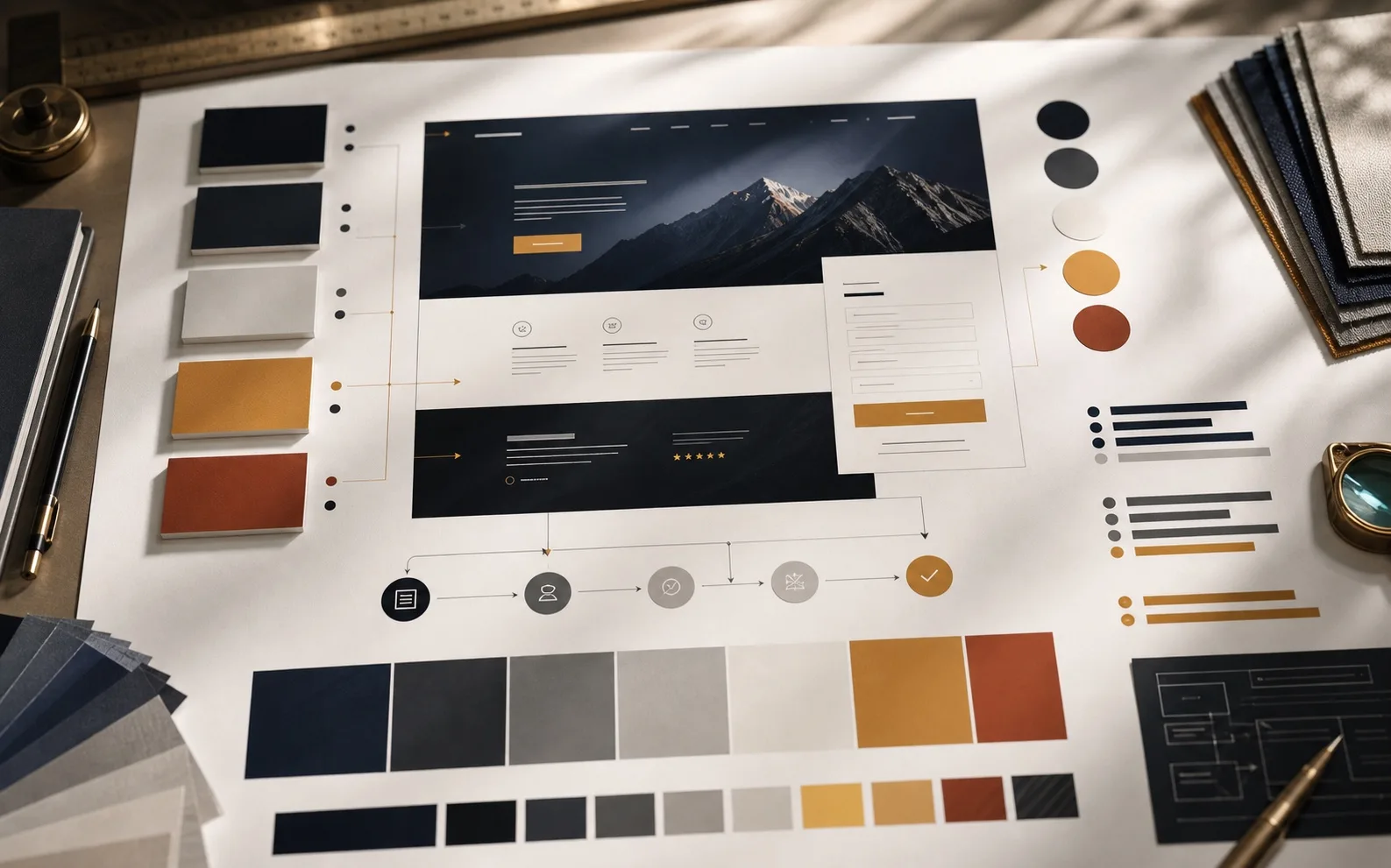
Pick colors by the work they have to do: scanning, proof, action, error recovery, and trust. Taste comes later.
Short answer
A landing page does not need many colors. It needs a small system the buyer can parse without thinking.
Use one strong text color, one quiet background, one action color, one proof/accent color, and one warning/error color. Everything else should earn its place.
The CTA color should not be chosen because it "pops." It should be the only color that consistently means action. The buyer learns the rule as they move down the page.
Build the palette
This is usually the darkest brand color. It carries headlines, navigation, and serious claims. It should not fight the CTA.
Body copy needs stable contrast on the actual background. If the visitor squints, the color system is already broken.
Primary CTAs, form submit buttons, and purchase actions should share one visible action rule. Secondary links can be quieter.
Badges, quotes, screenshots, logos, and result callouts need enough contrast to be seen without stealing the action color.
Forms need visible error states, focus states, and disabled states. Do not use the main CTA color for every state.
Name the colors by job: text, background, action, proof, warning, muted, rule. Hex codes alone do not stop drift.
Marketing Services grid
| Visible symptom | Likely cause | Check next |
|---|---|---|
| CTA colors change from section to section. | No action-color rule or too many inherited component styles. | Audit all button classes and map each one to primary, secondary, disabled, or destructive. |
| Hero is beautiful but hard to assess. | Image overlay, text color, and background contrast were chosen by taste. | Run the hero in mobile crop and test headline, subhead, and CTA contrast. |
| Forms feel low-trust. | Inputs, labels, focus states, and errors are too quiet or inconsistent. | Test the form with a real failed submission and inspect every state. |
| Proof cards look decorative. | Accent color is being used as decoration instead of evidence guidance. | Separate proof accents from action colors and link proof to the next decision. |
| Long pages feel tiring. | Low contrast, noisy accents, or no visual hierarchy between sections. | Reduce colors before adding sections. The page may need less visual vocabulary. |
Resources worth using
Use WCAG contrast guidance for clear text, especially body copy, forms, and small UI labels.
Open W3CButtons, borders, focus indicators, form controls, and chart marks need contrast too.
Open W3CFast manual contrast checks for foreground and background pairs.
Open WebAIMUseful for building a restrained palette and checking accessibility before CSS drift starts.
Open Adobe ColorUseful for palette exploration. Keep the generated palette under page-job control.
Open CoolorsUseful for thinking in design tokens and UI states instead of one-off color choices.
Open Material DesignIf the page has weak color hierarchy and weak action logic, it may be a conversion problem, not a palette problem. Check the page message, proof, form, mobile view, and offer path together.